Maxine Sheppard | Freelance travel writer and editor
About me
Work
Photography
About me
Work
Photography
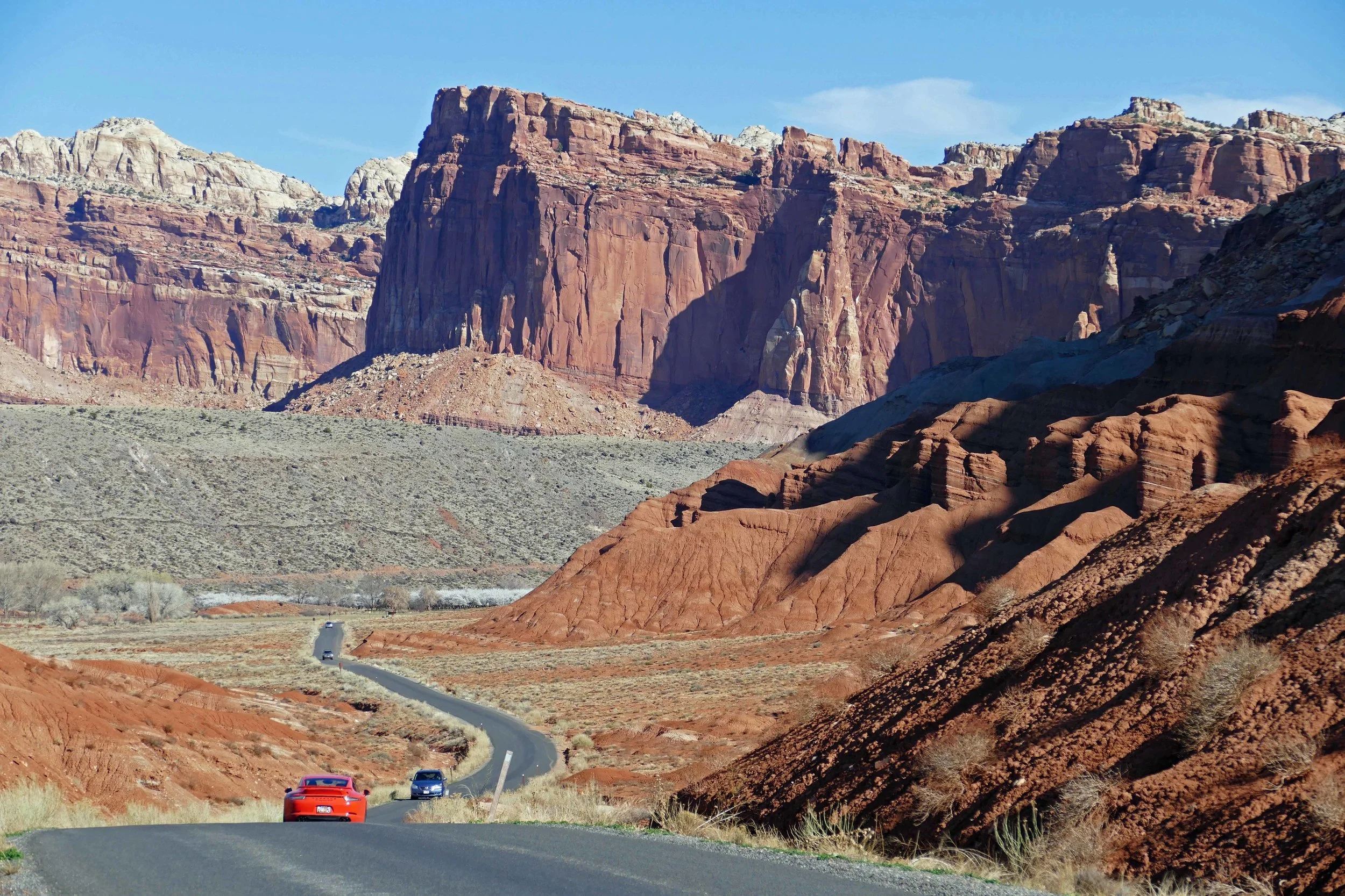
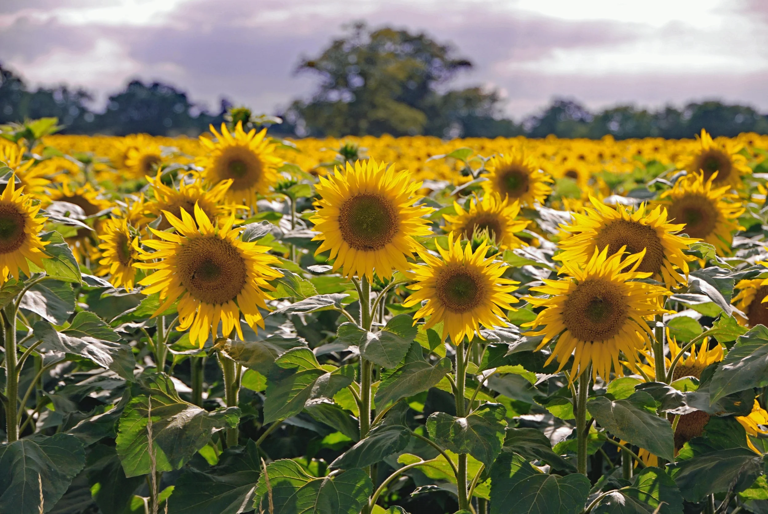
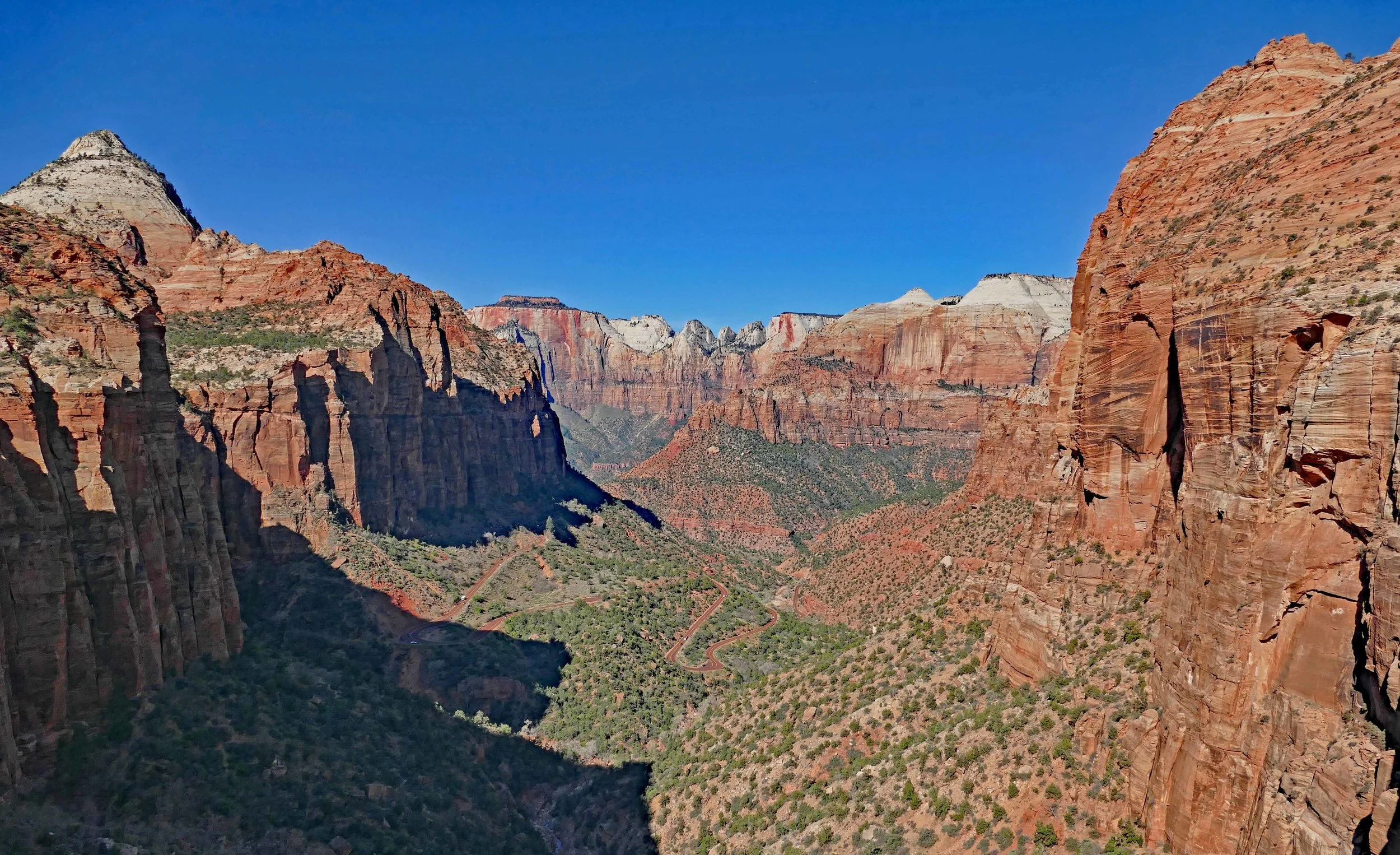
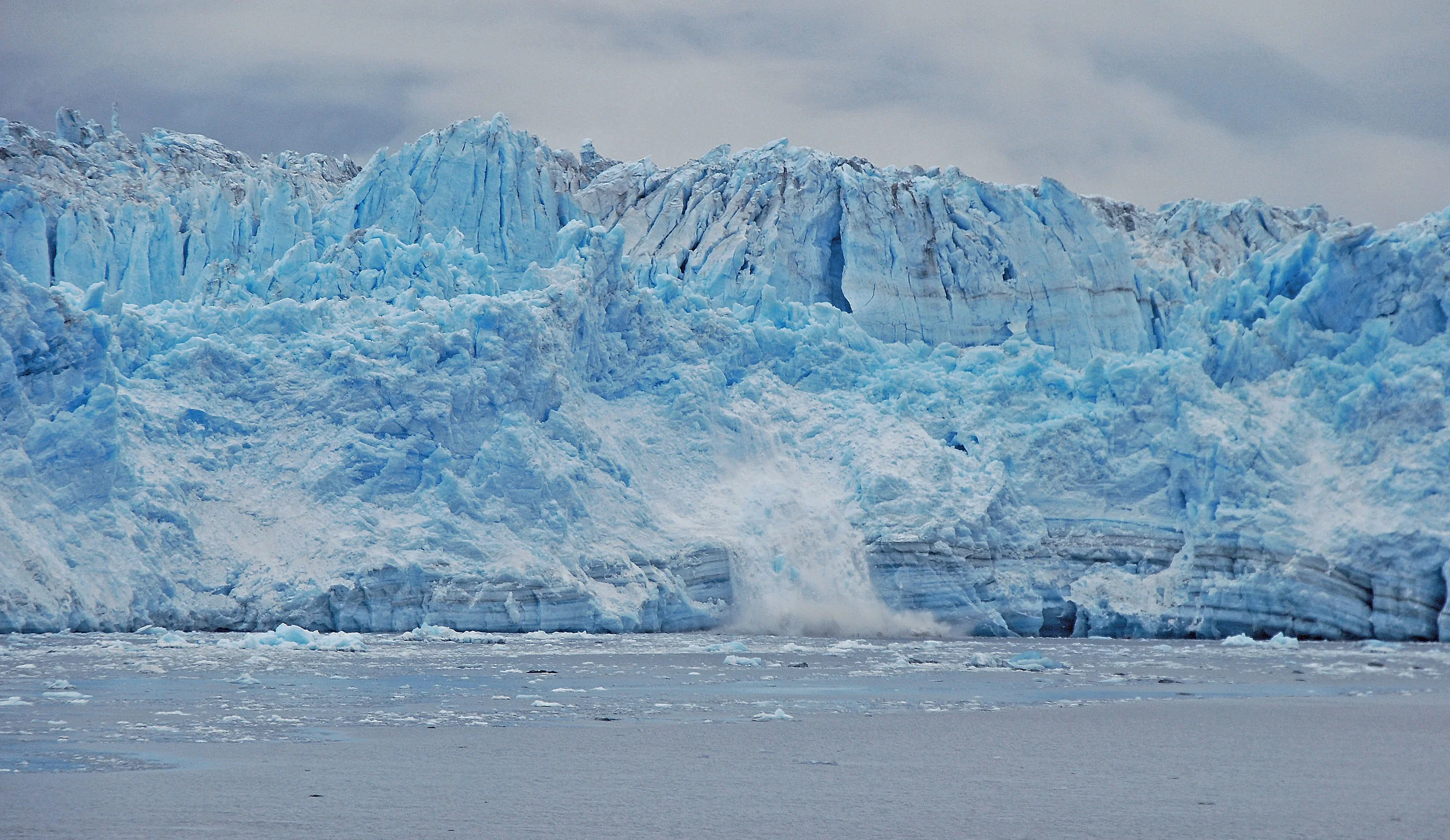
Photography